- Domain Address: The domain where the web chat will be deployed.
- Client Id: A unique key that identifies a specific Syllable AI target. For information on how to create a Client Id, please contact Syllable AI support at support@syllable.ai.
Installation
You have two options for installing Syllable Web Chat:NPM
To install via NPM, run the following command:npm install @syllableai/webchat
CDN
To include the web chat directly from our CDN, use the following script tag. Replace [VERSION] with the specific version you want to use (e.g., 1.0.0):<script async src="https://cdn.syllable.ai/scripts/webchat/syllable-webchat.**[VERSION]**.min.js" />
Alternatively, you can use the latest version:
<script async src="https://cdn.syllable.ai/scripts/webchat/syllable-webchat.latest.min.js" />
Usage
You have two options for using Syllable Web Chat. For either method, you should replace ‘MY_CLIENT_ID’with your valid Client ID.NPM using JavaScript or Typescript
CDN directly in HTML
Add this script above the HTML<body> element:
Add Optional Container
Optionally, add a div container to your HTML where the Syllable Web Chat will be rendered (if not specified, Syllable Web Chat will be appended to the bottom of HTML body tag):<div id="syllable-webchat-container"></div>
You may need to adjust the z-index of this div container based on your layout.
Additional configuration
The Syllable Web Chat can be extensively configured to meet your specific requirements. For additional configuration, please contact Syllable AI support at support@syllable.ai. Below are the available parameters that can be customized: Setembed_mode to true to hide the iframe-internal header (the dark band with the minimize button) when wrapping the chat in your own window chrome.
Web cards
Syllable offers graphical web cards to display structured data in a rich, visual format within the Web Chat channel.To enable this, your tool must call an endpoint that returns a card-formatted response, which Web Chat then renders as a card UI.
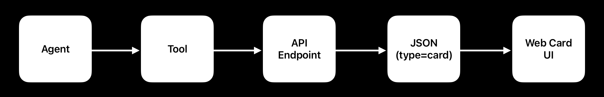
Tool definition requirements
The tool definition requires the following to function:- It must have “propagate_tool_result” value set to true in order for the result to be passed to Web Chat
Reponse format
Your endpoint must return data in the following response format:- The “result” object must have attribute “type” with value “card” for the chat to identify that the results are meant to be displayed in the form of the Card
- The results can have a list of cards to be displayed contained under “list”, each being defined by the following schema:
Card object schema
Card can be composed from the individual sections, each section is optional:- media - top banner or standalone image
- imageUrl - required path to the image
- originalImageWidth, originalImageHeight - optional dimensions for preserving aspect ratio, if not specified the image will be contained in the square and filled using cover background style, the image will scale to fill the available space
- maxHeight - maximum height of the image useful for banners to maintain the fixed height
- content - content area where description is visible, usually avatar of the person like a provider with name, title, specialty
- header
- subheader
- description
- avatarImageUrl - optional path to avatar image, will be rendered in circle container, if not provided it won’t be visible, if provided as empty string “” it will render image placeholder, if not provided it will adjust the space to accommodate headers and description better
- contentAlwaysLeft - aligning content always to the left, by default the content on smaller screens is center aligned
- actions - multibutton and option panel where more controls and structured information can be added like, text, buttons, links
- type - available options: text, button, link
- text - optional text to be displayed, if there is an icon instead it will just show icon button
- icon - optional icon that will appear on the left side of text specified, possible values: phone, email, chat, calendar, arrow
- link - link url
- cta - bottom main button
- text - optional text to be displayed, if there is an icon instead it will just show icon button
- icon - optional icon that will appear on the left side of text specified, possible values: phone, email, chat, calendar, arrow
- link - link url
Tool definition example:
This is an example tool that queries an endpoint for a service provider and returns the data in a format to display as a card.Common use cases
Card configuration allows the following to show:- Standalone image - use media
- Provider, location card - use content and cta and optionally actions, for full mode combine with media
- Structured text with header and content - use content with header and description
- A visible button - use cta pointing to the link url alternatively actions with 1 or more entries